⌲ Client: Food Access LA
Helping revitalize the Crenshaw Farmers’ Market
The Challenge:
Bring greater visibility and renewed energy to a long-standing community institution that had become under-recognized in recent years. Our goal was to increase awareness, foot traffic, and community engagement by reintroducing the market in a way that honored its cultural roots while making it feel fresh, relevant, and inviting.
Brand ⌁ Web ⌁ Advertising ⌁ Events

The BRANDGUIDE
Borrowing from both Food Access LA’s parent brand, and amplifying elements of the Crenshaw Farmers’ Market’s interpretation we found a harmony between reputable and human—expert-led and grounded within the community’s culture. This served as the visual and linguistic foundation for all that would come.
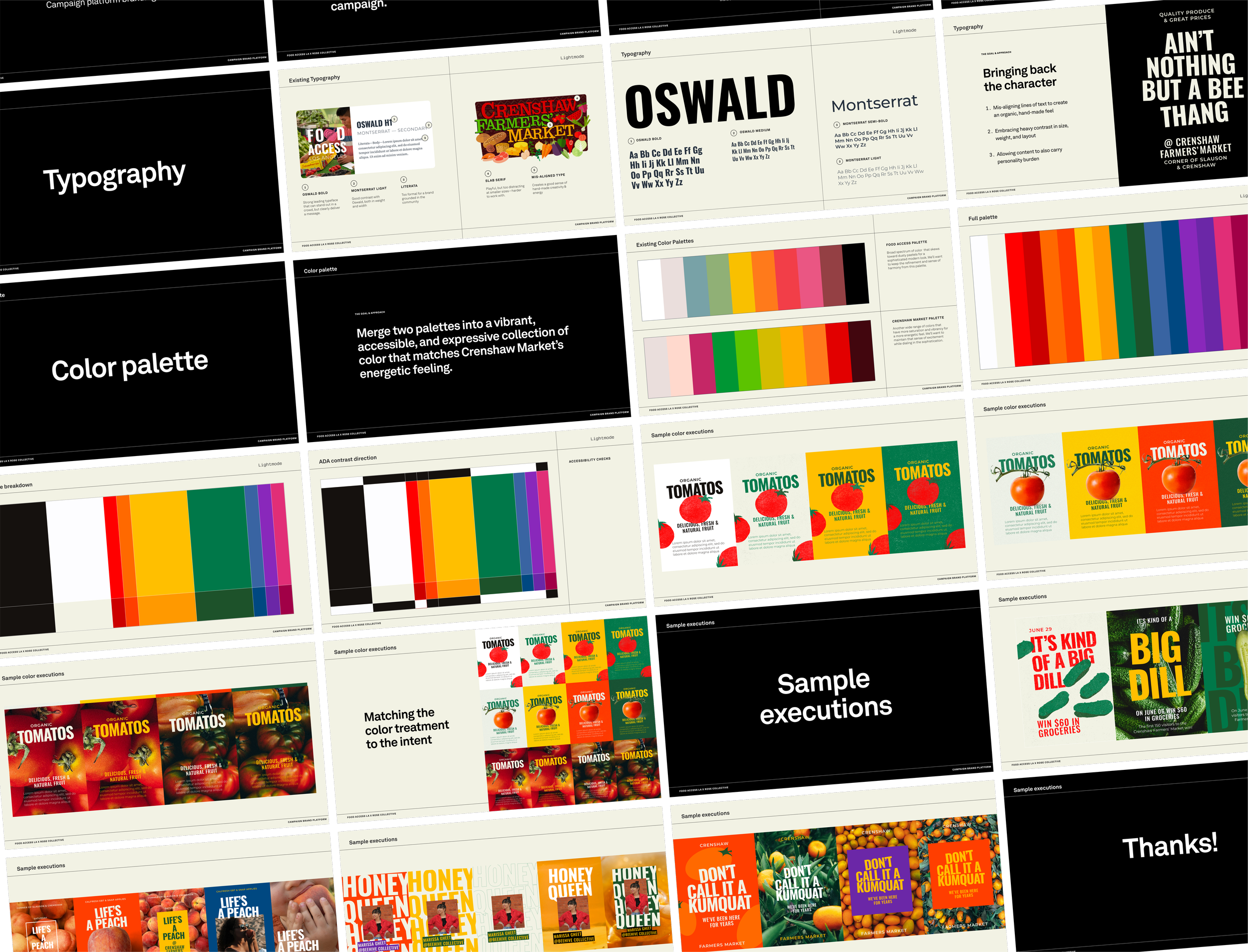

The Ads
With a balance of clever pop culture references and on-the-nose but motivating exposition, we stood out from the noise in people’s feeds—delivering them details, offers, and a sense of excitement. With the new website as their destination, users could enter our marketing funnel and stay engaged longterm. The result: reaching over 470,000 people and surpassing 1.4 million impressions.
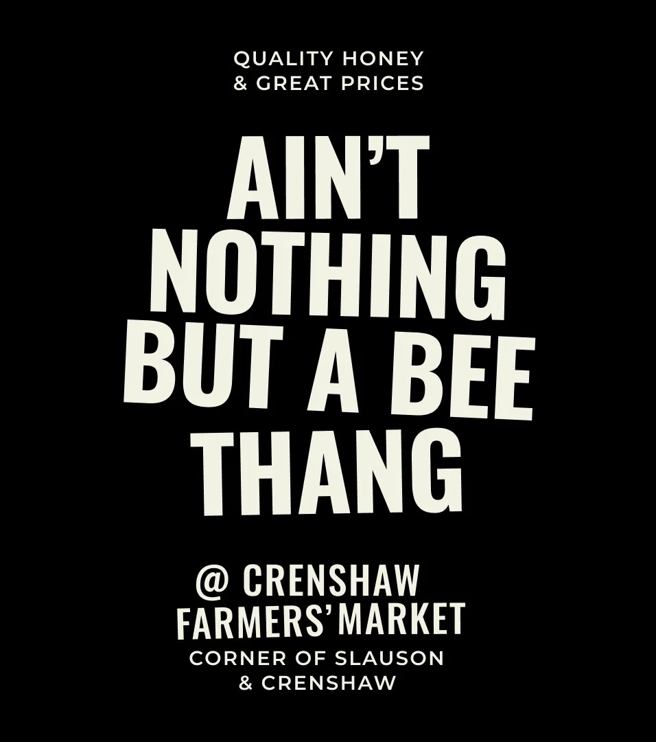
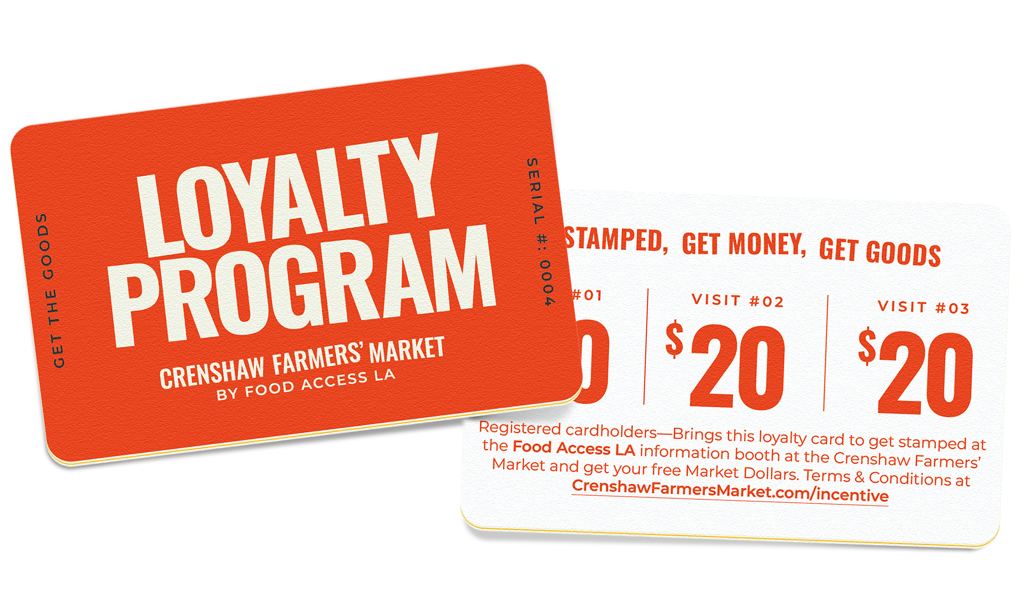
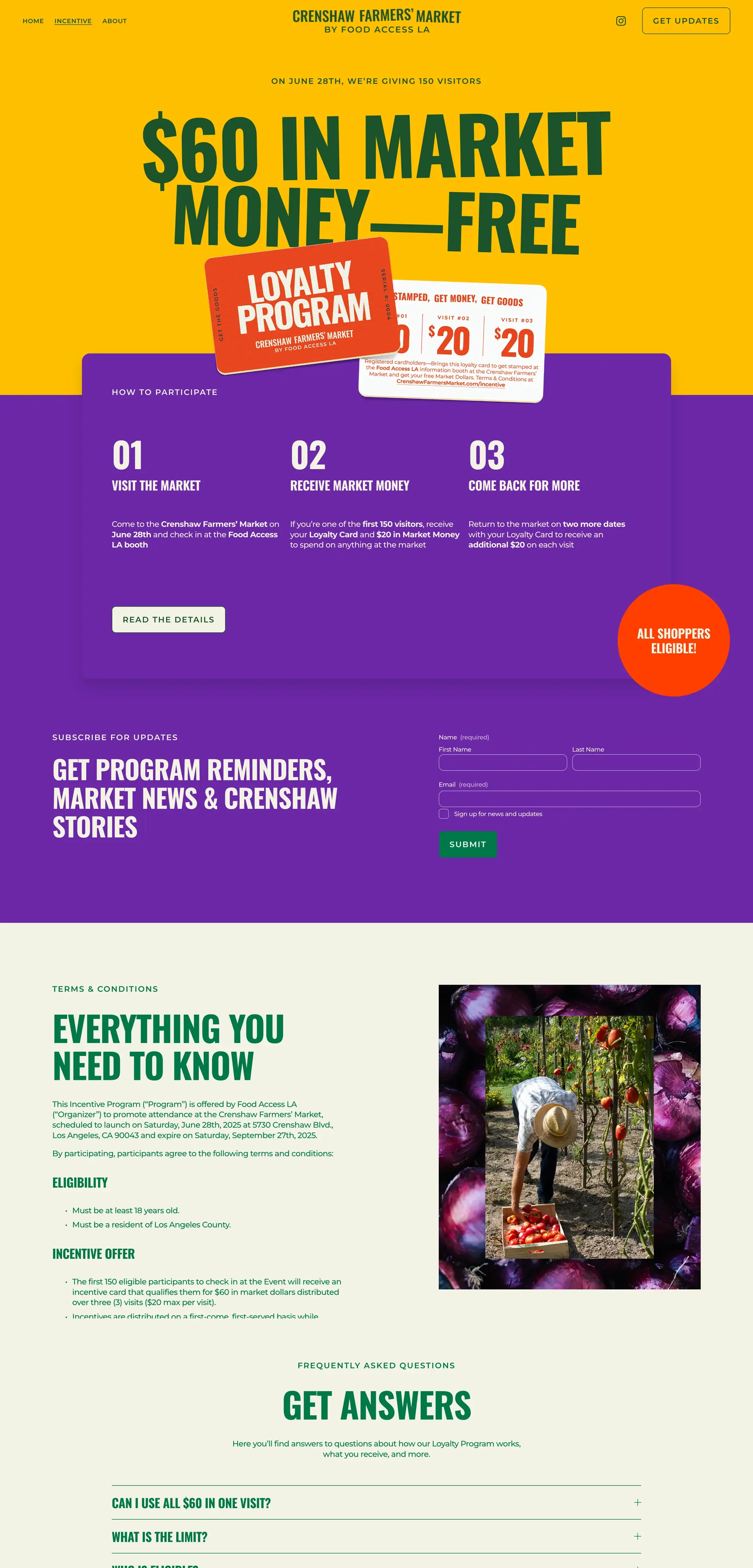
The incentive
We started with the insight that having shoppers visit a market three times dramatically increases their likelihood of returning a fourth, fifth, and beyond. From there we set out to bring as many customers back for third visit. Positioning it as market loyalty, we build community and help folks afford their groceries while we are at it.

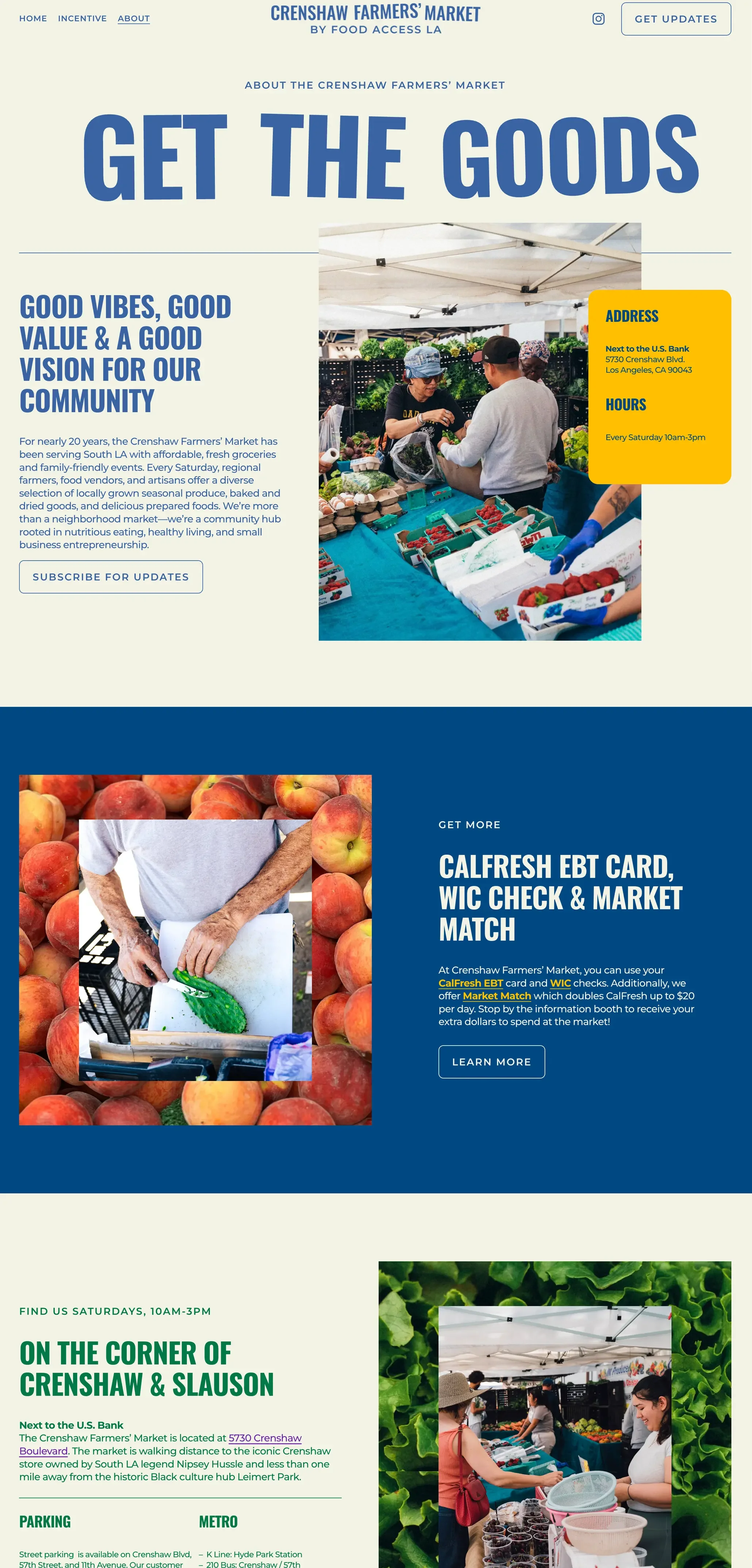
The Web
We designed and built the website as a central hub where community members can learn about the market, explore the loyalty program, and easily join the email list. We created an automated welcome email series to share stories and actions centered on the market, helping to build deeper connections with new subscribers. In just three weeks, the list grew to 400 subscribers with an impressive 48% open rate—significantly surpassing industry benchmarks.
⌲ Contact us
Let’s talk
Let’s connect about what you’re building and how we can support it—from early ideas to full-scale campaigns.
Whether you’re looking for thought partnership or creative execution, we’re here to collaborate and help bring your vision to life.